
In a world dominated by founder-led personal brands and massive ad budgets, building an organic community around a faceless company page on LinkedIn seems almost impossible. Yet, that’s exactly what NeetCode accomplished, transforming its page from a simple marketing channel into a core piece of infrastructure for over a million developers preparing for technical interviews. We’re joined by Milena Traikovich, a demand generation expert who has deeply analyzed this unique approach. She’ll be sharing insights on how NeetCode rejected the standard growth playbook, focused on pure utility to build trust, and ultimately changed the language of an entire professional category. We will explore the strategic decisions behind their mobile-first content, their unconventional use of testimonials, and how they turned a suppressed channel into their second-largest source of social traffic.
The goal was for developers to say “I’m grinding NeetCode,” a major perception shift. What were the first steps you took on LinkedIn to embed the brand into their daily prep ritual, and how did you measure if this shift in perception was actually happening?
The very first step was a mental one: we had to stop seeing LinkedIn as a place to promote and start seeing it as a study surface for our audience. Developers were already on the platform looking for jobs and networking, so their minds were in the right place. Our job was to intercept that “doomscrolling” and replace it with value. We began by transforming our educational content into LinkedIn-native formats, like cheat sheets and carousels, that felt like revision material. The idea was to make our feed an essential part of their prep. As for measurement, we looked beyond simple impressions. We started seeing unsolicited DMs from users, not just with feedback, but with bug reports and testimonials. The real proof was in the comments—people started tagging the NeetCode page to help others in threads we weren’t even a part of. When we saw developers organically saying things like “I’m grinding NeetCode” in posts about their job search journey, we knew the perception shift was real. It wasn’t a metric on a dashboard; it was a change in the ecosystem’s language.
Most brands struggle with faceless company pages, yet you leaned into it. Could you describe the content philosophy that allowed you to build trust and authority without relying on personal branding or a budget? Please walk us through the creation of a high-value post.
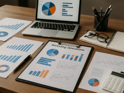
Our philosophy was simple: utility is the ultimate currency of trust, especially with a skeptical audience like developers. They’ve been promised the world by countless tools and are incredibly “no fluff.” Since we were a faceless page with no ad budget, every single post had to earn its place in the feed by being genuinely helpful. A typical high-value post would start with a very specific developer pain point. For example, instead of a generic post, we’d focus on a tricky data structure or a common interview question. We’d design a clean, static carousel that broke the concept down into clear, digestible slides. The design was deliberately polished and easy to read, standing in stark contrast to the dense, unpolished technical content common in the space. There was no selling, no fluff, just pure, upfront value. This relentless focus on helping, not selling, is what built the trust that a personal brand often provides.
The technical prep space was filled with animated visuals, but you abandoned this playbook to attract your ideal customer. Can you walk me through the data or observation that sparked this decision, and what was the immediate impact on your follower quality and engagement?
It was a tough but necessary decision. We observed that while animated GIFs and flashy visuals were getting likes and shares, the engagement felt shallow. The comments were generic, and the followers we attracted weren’t our ideal customers—the serious developers actively preparing for interviews at top-tier companies. The data wasn’t just about the engagement rate, but the quality of that engagement. We realized we were trading long-term value for short-term vanity metrics. So we made the call to kill the animation playbook entirely. The immediate impact was a noticeable shift in our comment sections. Instead of “cool animation!” we started getting deep, technical questions and users sharing their own experiences with the problems we posted. It felt like the conversation matured overnight. We sacrificed the broad, low-intent engagement to cultivate a community of the right people, which ultimately turned the page into a powerful revenue engine.
Shifting to a mobile-first design was a critical performance lever. Beyond using 1080×1350 carousels, what specific formatting changes had the biggest impact? Please share an example of how you repackaged an idea from a desktop-first format that underperformed into a successful mobile-first post.
Realizing that over 60% of our audience was on mobile was a massive wake-up call. The 1080×1350 format was key because it dominates the screen real estate, but the magic was in the micro-details. We ruthlessly cut down text, replacing dense paragraphs with scannable bullet points. We increased font sizes and used high-contrast designs so the content was legible at a glance. I remember one specific post about common coding mistakes that we initially published as a long-form text post, and it completely flopped. It was full of valuable information, but it was a wall of text. We repackaged that exact same idea into a five-slide carousel. Each slide had a clear, bold heading for one mistake, a simple visual icon, and two or three concise bullet points. The performance was night and day. It was the same information, but presented in a way that respected the user’s context, and that small change made all the difference.
You transformed testimonials from bottom-funnel proof points into high-performing organic content. What was the key to framing these posts to feel like value instead of promotion? Please describe the structure of a testimonial post that achieved over 100,000 impressions.
The absolute key was restraint. We treated testimonials as stories from the community, not as marketing assets. When a user sent us a message saying they landed a job at a major tech company after using our platform, we didn’t add any flashy graphics or a “You can too!” call to action. The structure of our most successful testimonial post—the one that hit over 110,000 organic impressions—was incredibly simple. It was essentially a screenshot of the user’s message, presented cleanly, with a short, humble caption thanking them for sharing their journey. There was no sales language, no link to our site, nothing. It was pure, unadulterated social proof. By removing our own marketing voice, the post felt authentic and celebratory. This created a powerful feedback loop where other developers felt inspired and, after their own successes, would send us their testimonials, giving us more authentic content to share.
What is your forecast for brands trying to build communities on professional networks like LinkedIn?
I believe the future for brands on professional networks lies in moving away from being a “broadcaster” and becoming “infrastructure.” The model of just pushing out company news or promotional content is dying. The brands that will win are the ones that become a utility or a gathering place for a specific professional moment, just as NeetCode did for interview prep. This means a radical focus on providing tangible value, facilitating conversations between members, and earning trust through consistent service rather than clever campaigns. The goal shouldn’t be to build an audience that listens to you, but to build a community that relies on you and talks to each other. The platform’s algorithm will always be a black box, but genuine utility is the one variable you can control, and it’s the most reliable foundation for long-term growth.